Eldore Construction

Eldore_Construction_priest_lake_logo_design_tran_creative_idaho

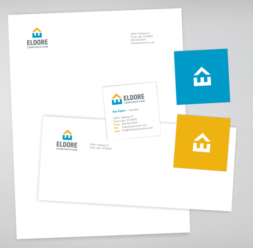
Eldore Construction in Priest Lake, Idaho specializes in lake homes, custom decks, additions and renovations. They hired Tran Creative to develop a new visual identity system, including a new logo.

After much research and many logo concepts, in 2 simple shapes, the final chosen logo captures the “E” laying the solid foundation of the house. The yellow arrow points upward onto success. Together, the 2 shapes form a house in the negative space.

Blue conveys experience, stability, safety and the water of Priest Lake. Yellow is for the sunshine on the lake, innovation and beacon of passion for perfection.


Eldore_Construction_Stationery_graphic_design_tran_creative

Sandpoint Furniture

Sandpoint_Furniture_logo_design_tran_creative_coeur_d_alene_idaho

Established in 1945, Sandpoint Furniture has nearly 100,000 square feet of space and showroom. From carpet, mattress, cabinets, glass, blinds to furniture and clearance center, Sandpoint Furniture is a one stop shop for your home.

Tran Creative was hired to develop a visual identity system for this shopping center. After several months of research and a few hundred logo concepts, the final chosen logo captures the small town feel of Sandpoint, Idaho in the form of a signature “S”. The signature mark conveys the fine craftsmanship, tradition and solid reputation of a great store that has been in business for 70 years. We also frame the logo into a square to showcase the nature aspects of Sandpoint: mountain, lake, waves, blue sky and greenery.

The new logo is applied onto business cards, gift certificate, shopping bags, letterhead, envelope, brochures, store signage, price tags, … and all print collaterals.

Pinnacle Physical Therapy

Pinnacle_Physical_Therapy_logo_graphic_design_tran_creative_coeur_dAlene_idaho

Pinnacle Physical Therapy and Sports Medicine provides quality physical therapy with 2 locations in Post Falls and Coeur d’Alene.

Pinnacle PT is growing and evolving. They hired Tran Creative to provide branding services and help tell their story visually with a new logo. Research showed that many “Pinnacle” logos often have the mountain peaks. We wanted to be unique and stay away from the obvious mountain. After much research and about 100 logo concepts, the final chosen logo captures the “P” for Pinnacle. The logo also exudes movement, pinnacle of life in green (without being too obvious). The road to recovery (in blue) is typically not easy. But with persistence, patience and determination, and care from Pinnacle PT, one will be able to get back on top, to the pinnacle of their life.

Blue and green capture the region’s colors. Blue is for healthcare and experience. Green is for healing and recovery.

The new logo is applied onto all print collateral and a new & responsive web site: PinnaclePhysicalTherapy.org


Pinnacle_Physical_therapy_website_design_tran_creative_coeur_d_alene_idahopinnacle_physical_therapy_rackcard_graphic_design_tran_creative

Get In Touch

Interested in working with us?
We would love to help TELL YOUR STORY.

Logo

Create an identity to break the generic mold.

Web

Provide sleek and modern resources for your clients.

Marketing

Tell your story and increase your revenue.