Action Orthopedic and Sports Medicine

Action_Orthopedic_and_Sports_Medicine_Logo_Design_Tran_Creative

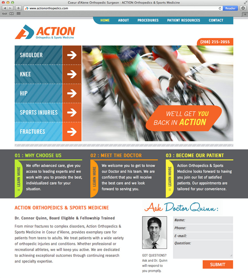
ACTION Orthopedics & Sports Medicine is opening up a brand new practice in Coeur d’Alene, Idaho. They hired Tran Creative to create a brand identity system, including print collateral pieces and a web site.

During research, we’ve found many orthopedic logos with the “orthopedic tree” and obvious human bodies. After many logo explorations, the chosen logo captures the “A” in motion. Because ACTION dealt with many specialties, we wanted flexibility to encompass variety of procedures. Tran Creative’s designers stylized 2 simple shapes that convey non specific body parts: elbow, arm, leg, knee, leg, bone, joint, etc. with an arrow in blue moving forward.

Color blue represents trust. Orange is symbolic of innovation and passion for continuation of service excellence.

See the website: www.ActionOrthopedics.com


Action_Orthopedic_and_Sports_Medicine_website_Design_Tran_Creative Action_Orthopedic_Rackcard_brochure_design_tran_creative

Shannon Bukowski

Shannon_Bukowski_Logo_design_tran_creative

Shannon is an associate broker who recently joined Fortus Realty, Inc., one of our long time clients. Tran Creative was hired to provide Shannon with a new visual identity.

After many logo explorations, the chosen and new logo captures the “S” for Shannon and the pathway to finding your dream home (whether through selling or buying). Color gem blue conveys trust, experience, and friendliness. Color burgundy expresses sophistication and classiness.

To learn more about Shannon, visit: www.FortusRealty.com

Get In Touch

Interested in working with us?
We would love to help TELL YOUR STORY.

Logo

Create an identity to break the generic mold.

Web

Provide sleek and modern resources for your clients.

Marketing

Tell your story and increase your revenue.