Cycle Central

Cycle_Central_logo_design_tran_creative

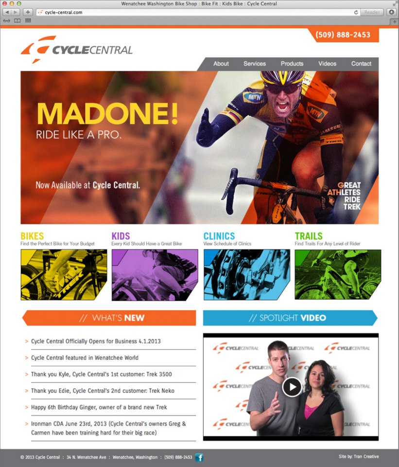
Cycle Central is a bike shop in Wenatchee, WA. They hired Tran Creative to develop a new brand identity & web site. After many logo variations, we’d like to introduce the new visual identity for Cycle Central. The new logo consists of 4 shapes forming letter “C” in the negative space. We did not want to incorporate any bike specific elements: handle bar, chain, frame, etc. to provide future flexibility for Cycle Central to carry more products than just bikes. However, we stylized the shapes to have elements of cycling: aerodynamic, speed, and movement. Color Orange represents passion for exceptional customer service, energy and love for the sports. Gray stands for progressiveness and stability.

The new logo is applied on variety of applications: race kits, cycle jerseys, sales tags, apparels, signage, and much more.

See the new website: cycle-central.com
 

Cycle_Central_website_design_tran_creative

1 Tri Coaching

1Tri_logo_design_tran_creative

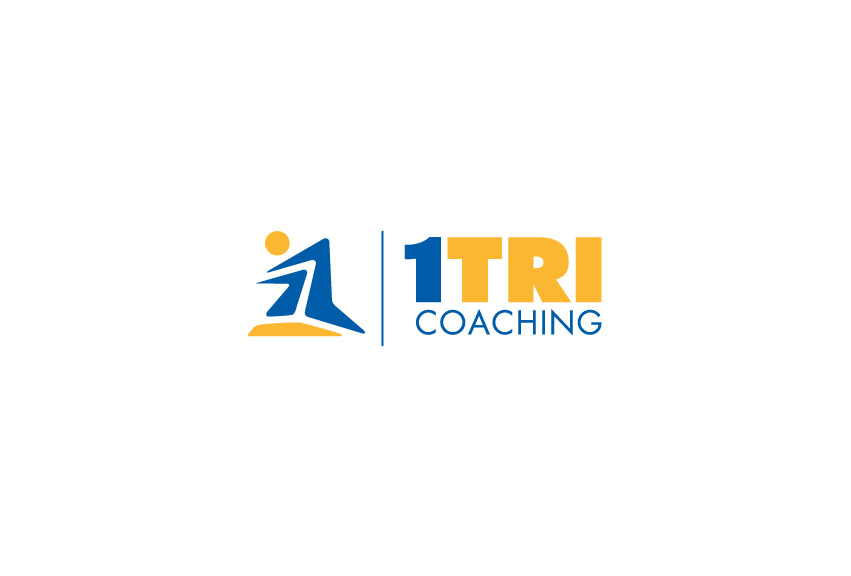
1TRI Coaching hired Tran Creative to provide them with a new logo. We also helped with the naming. 1TRI has many meanings: one on one coaching, one vs. oneself (overcoming self-doubt), becoming #1 (the best you could possible be). Research shows that there are many triathlon related logos with 3 swim bike run figures. We want to give 1TRI a unique look that would make them unique, creative, and stand apart from the norm.

After many logo variations, designers at Tran Creative crafted 3 simple shapes to form #1. The stylization conveys: speed, movement, athlete body in motion, mountain peak of the Coeur d’Alene region, and the challenging yet rewarding road to success.

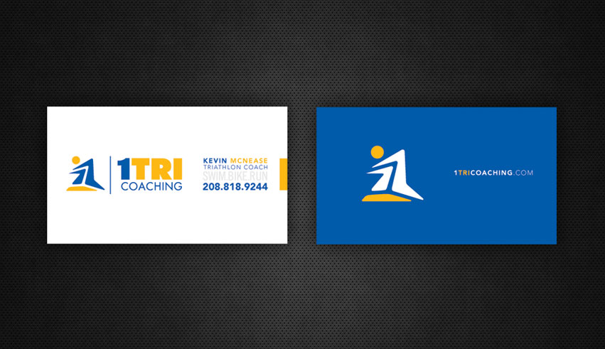
1Tri_stationery_design_tran_creative

Get In Touch

Interested in working with us?
We would love to help TELL YOUR STORY.

Logo

Create an identity to break the generic mold.

Web

Provide sleek and modern resources for your clients.

Marketing

Tell your story and increase your revenue.