Tran Creative creates the new brand identity for Business Belles, a network of business women in the Spokane region. The new logo captures: B, community network of people reaching out, thriving.

Tran Creative creates the new brand identity for Business Belles, a network of business women in the Spokane region. The new logo captures: B, community network of people reaching out, thriving.
Tran Creative creates the new brand identity for Delta 3 Coaching, cutting-edge company with Certified US Masters Swimming, USA Triathlon Certified Coach for able-bodied, parasport, and youth. Delta3 matches athletes from beginner to advanced level with elite and talented coaches in the US and International. The new logo captures: Delta – Triangle, D, 3, data & analytic graph, peak that one must climb to get to the top.
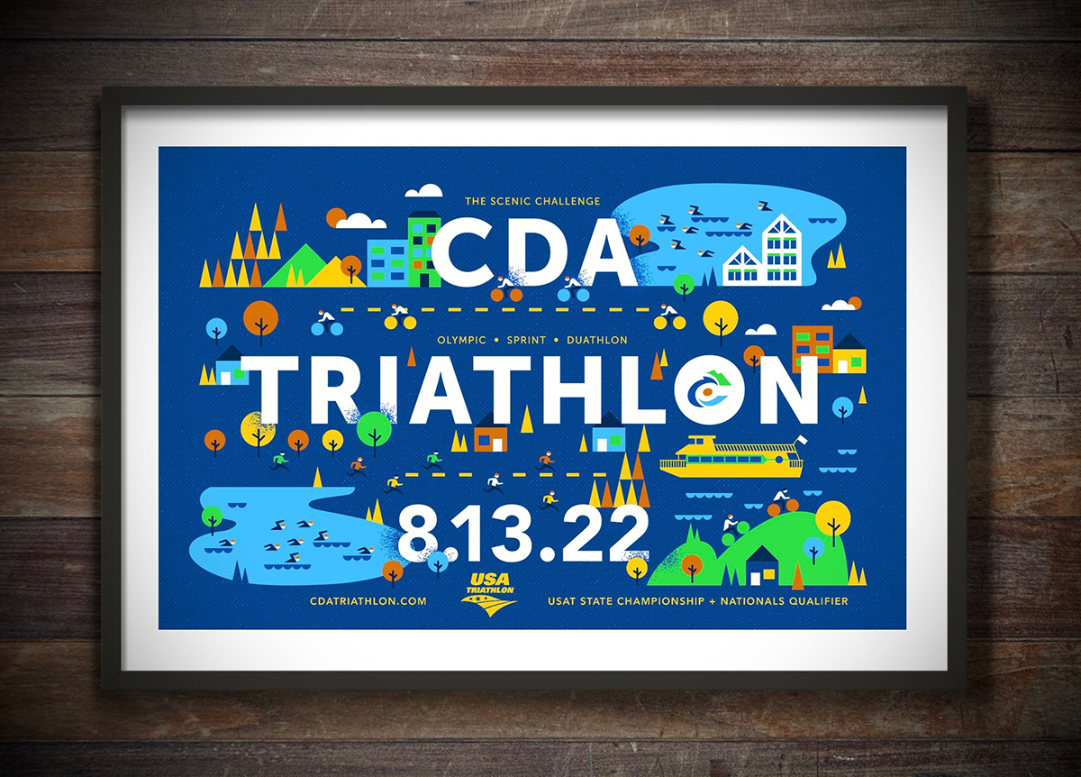
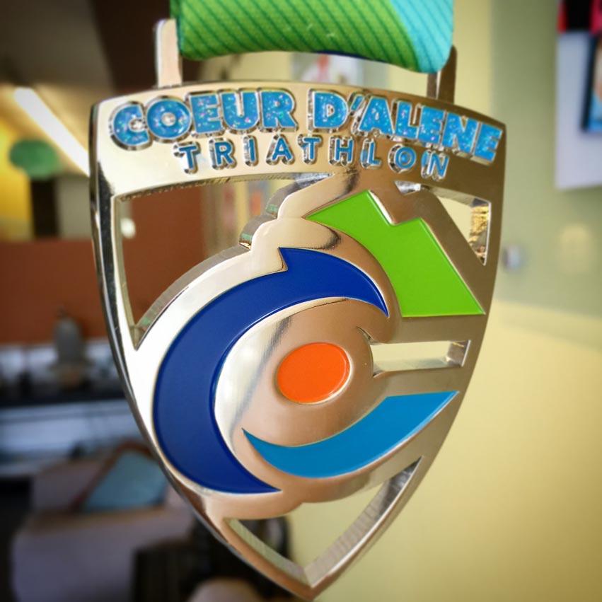
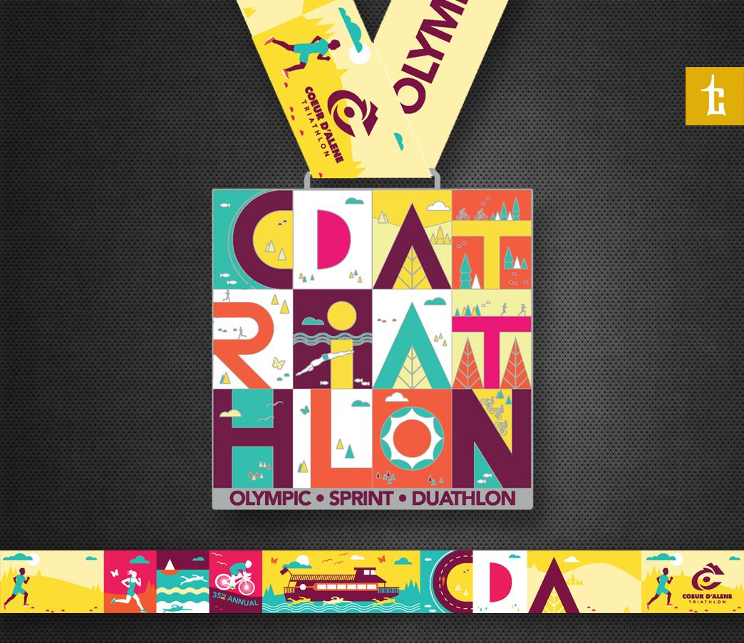
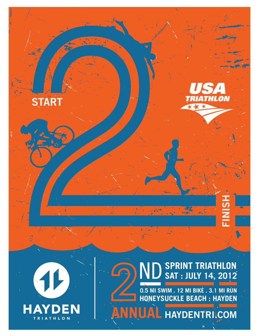
Tran Creative creates the new design for the 2022 CDA Triathlon. This year, CDA will be the destination for State Championship and National Qualifier. Custom medals designs will be featured soon.
REGISTER: cdatriathlon.com
![]()
![]()
![]()
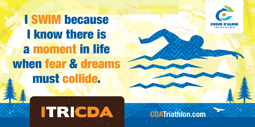
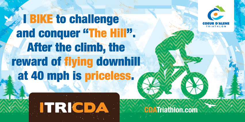
Tran Creative is excited to team up with the 2020 Coeur d’Alene Triathlon for epic swim bike run. For the 2nd year, CDA Triathlon will have a “deep water start” for its Olympic swim. Swimmers will board the cruise ship, which will take them out 1.5 km to transfer to the staging barge. From the barge, swimmers will enter the water to wait their turn at starting buoys for a 1500 meter swim to city beach. Who’s in?
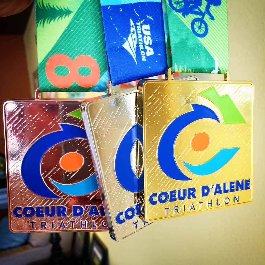
NEW DESIGN – 1st look at the all-new 2019 Coeur d’Alene Triathlon & Duathlon custom medal design. Each letter color is uniquely crafted with durable stained glass to magnify your finish. WHO wants one? Which distance will you do? WHO’s excited for the boat?

NEW DESIGN – Tran Creative is excited to team up with Coeur d’Alene Triathlon & Duathlon (under new ownership) for epic SWIM BIKE RUN racing. See you at the start line.
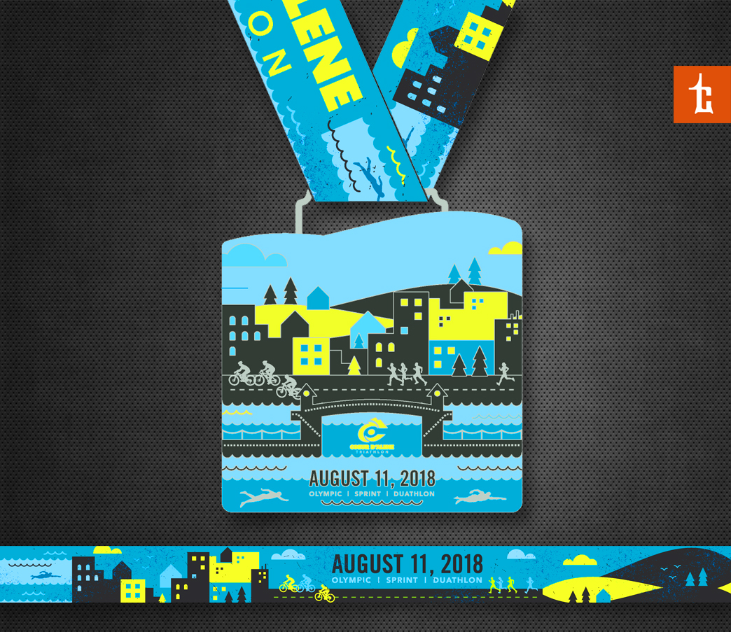
NEW DESIGN – #TranCreative is teaming up with Coeur d’Alene Triathlon for an epic day of SWIM BIKE RUN in downtown Coeur d’Alene. Here is the 1st look at the all new custom medal design with die cut, stained glass. Who wants one?

NEW DESIGN – #TranCreative is teaming up with Coeur d’Alene Triathlon for an epic day of SWIM BIKE RUN in downtown Coeur d’Alene.
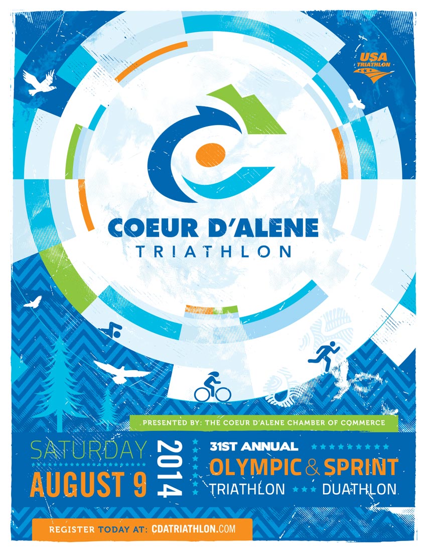
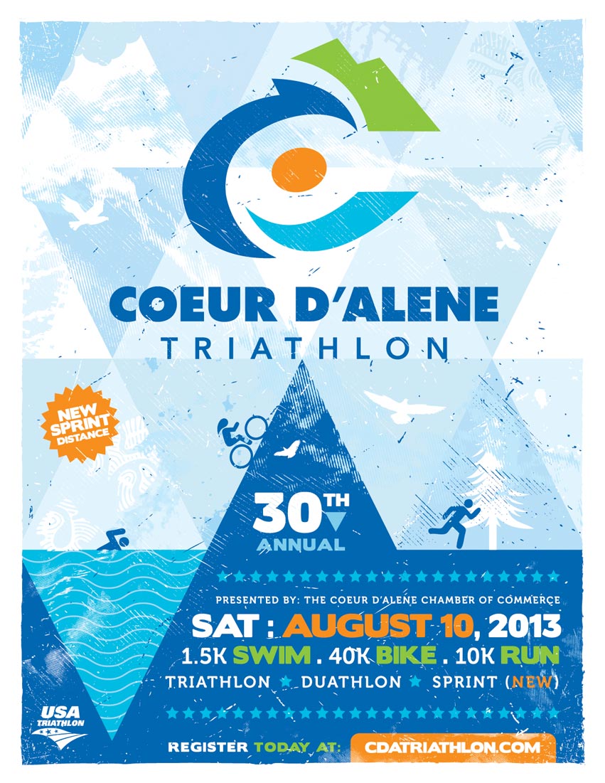
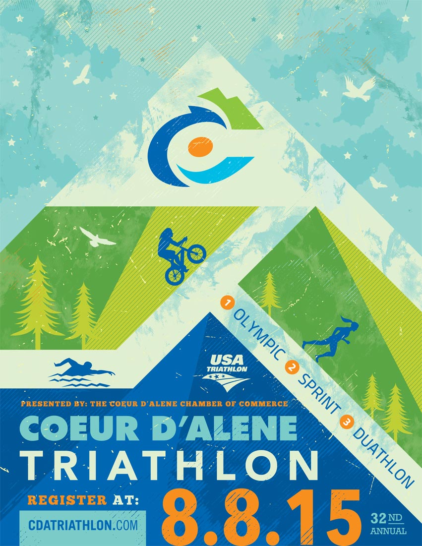
2015 marks the 32th anniversary for one of the premiere triathlons in the Inland Northwest – Coeur d’Alene Triathlon & Duathlon. Event organizers hired Tran Creative to create a fresh new look that communicates: scenic, progressiveness, and quality in such a historic annual sporting event.
After much research and many logo variations, the chosen final logo conveys speed, movement, scenic and simple enough to recognize and withstand the test of time for years to come. Research showed that there were many triathlon logos with typical SWIM BIKE RUN figures. We wanted CdA Tri logo to be unique in its own ways. Our designers crafted a “dynamic” letter “C”. The new logo also conveys speed, movement, active, bike wheel, athlete, water, wave, and mountain top. In doing so, we captured both aspects of the race: athlete & magnificient landscape of Lake Coeur d’Alene. Color Blue = water, lake. Green = nature, fresh. Orange is symbolic of Energy, Speed, and Passionate Commitment from organizers to bring the best possible race each year to participants. To learn more about the race, visit: www.CdATriathlon.com

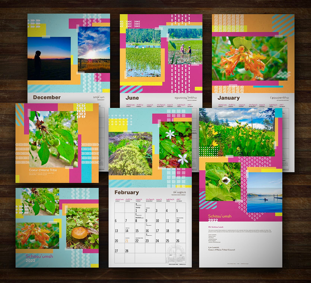
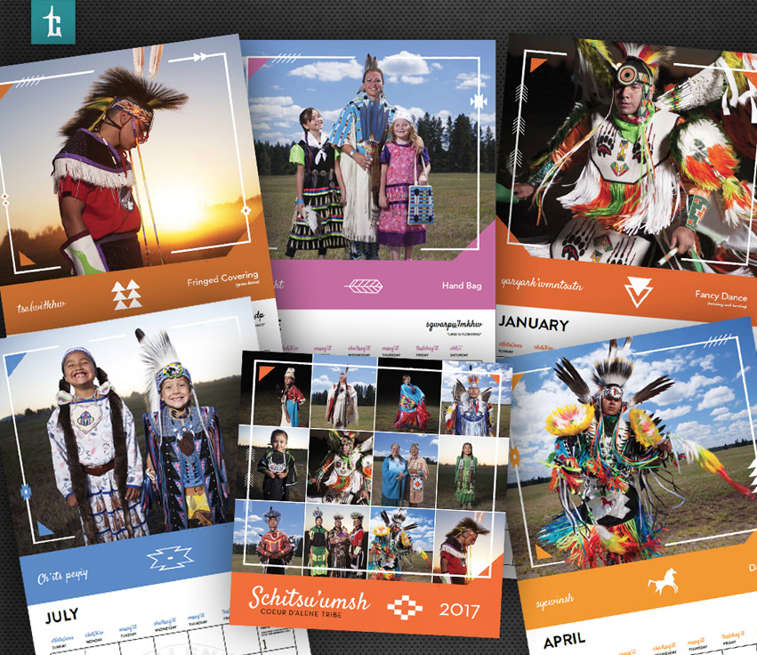
For the 9th consecutive year, Tran Creative designed the new calendar for the Coeur d’Alene Tribe. This year, tribal members took photos of summer and submitted for the calendar. We can always use more summer and sunshine around here, specially on this cold wintery day.
![]()
2020 Coeur d’Alene Tribe Calendar
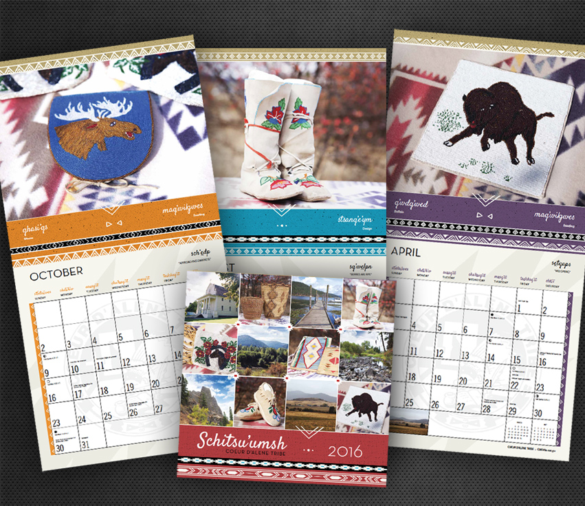
NEW DESIGN – We’ve been working with the Coeur d’Alene Tribe for 7 consecutive years on the calendar project. This year’s theme is water. For design execution, our designers utilized watercolor elements combined with tribal patterns to frame the photos while also allowing these gorgeous images to shine.

NEW PROJECT – Exciting news are happening for the Coeur d’Alene Tribe’s Marimn Health. We are happy to concept and design the new Community Report for our client to feature these stories.

2019 Coeur d’Alene Tribe Calendar
NEW DESIGN – We’ve been working with the Coeur d’Alene Tribe for the 6th consecutive year to design their calendars. The unique exhibits were handmade by Tribe families. We utilized of the design elements & patterns from the fabric and incorporated them into the design.
2016 Coeur d’Alene Tribe Calendar
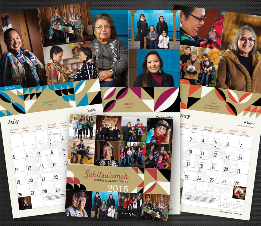
The Coeur d’Alene Tribe has hired Tran Creative to design their Calendar for the 4th consecutive year. Clothes were handmade by Tribe families. We utilized some of the design elements & patterns from the fabric and incorporated them into the calendar design.
2016 Coeur d’Alene Tribe Calendar
The Coeur d’Alene Tribe has tasked Tran Creative with the 2016 Calendar design for a 3rd consecutive year. We thoroughly enjoy closing out the year working with the Tribe’s PR/Communications team. Happy New Year!
2015 Coeur d’Alene Tribe Calendar
Working with the Tribe PR team and photographer Jerome Pollos for several months, we were able to capture incredible stories and visuals of families in the tribe with up to 4-5 generations.
Tran Creative creates the new brand identity for Liberty Launch Academy, a private school opening this Fall inside a 200,000 square feet facility in Liberty Lake, WA with the goal to be the #1 private school in the country. Working with the design team at LLA, the new logo captures: L, L, A, boomerang, students prepared and launched into the world will be able to return to make an impact in their community. We conducted focus groups, interviewed parents, students and keyed in on 5 Values: (1) Building Character, (2) Love of Learning, (3) Learning Has No Walls, (4) Mentorship and (5) One Size Does Not Fit All.
Visit the new website at: libertylaunchacademy.org
Teaming up with the City of Post Falls, Idaho Park & Rec for the 2nd year, Tran Creative creates the new design for the 2022 Post Falls Triathlon. Whether you’re a beginner or elite athlete, this USAT sprint race will be a fun test: 0.5K Swim, 19K Bike, 5K Run.
We are excited to team up with the City of Post Falls Parks and Recreation for the 2020 Post Falls Triathlon on Aug. 2nd. This USAT race is a great distance for beginners and experienced athletes: 0.3 mile lake swim, 12 mile bike and 5K run.
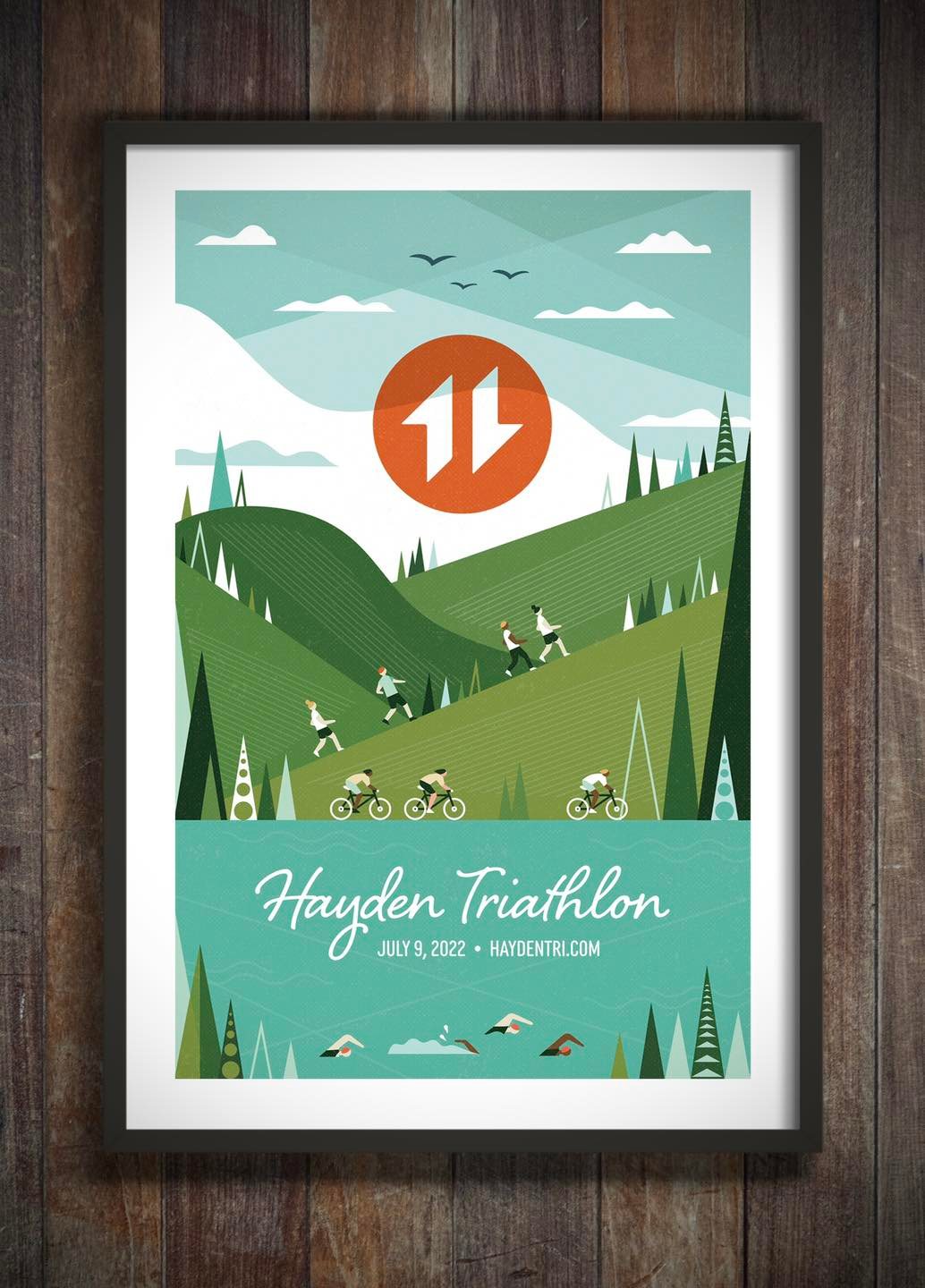
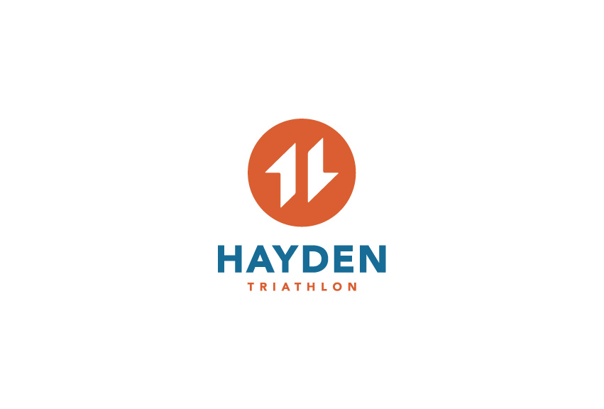
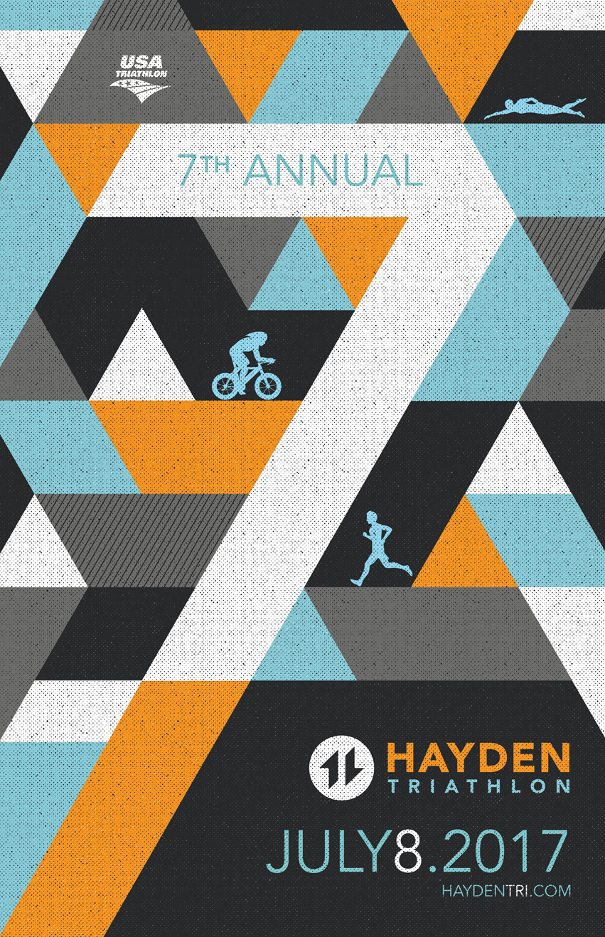
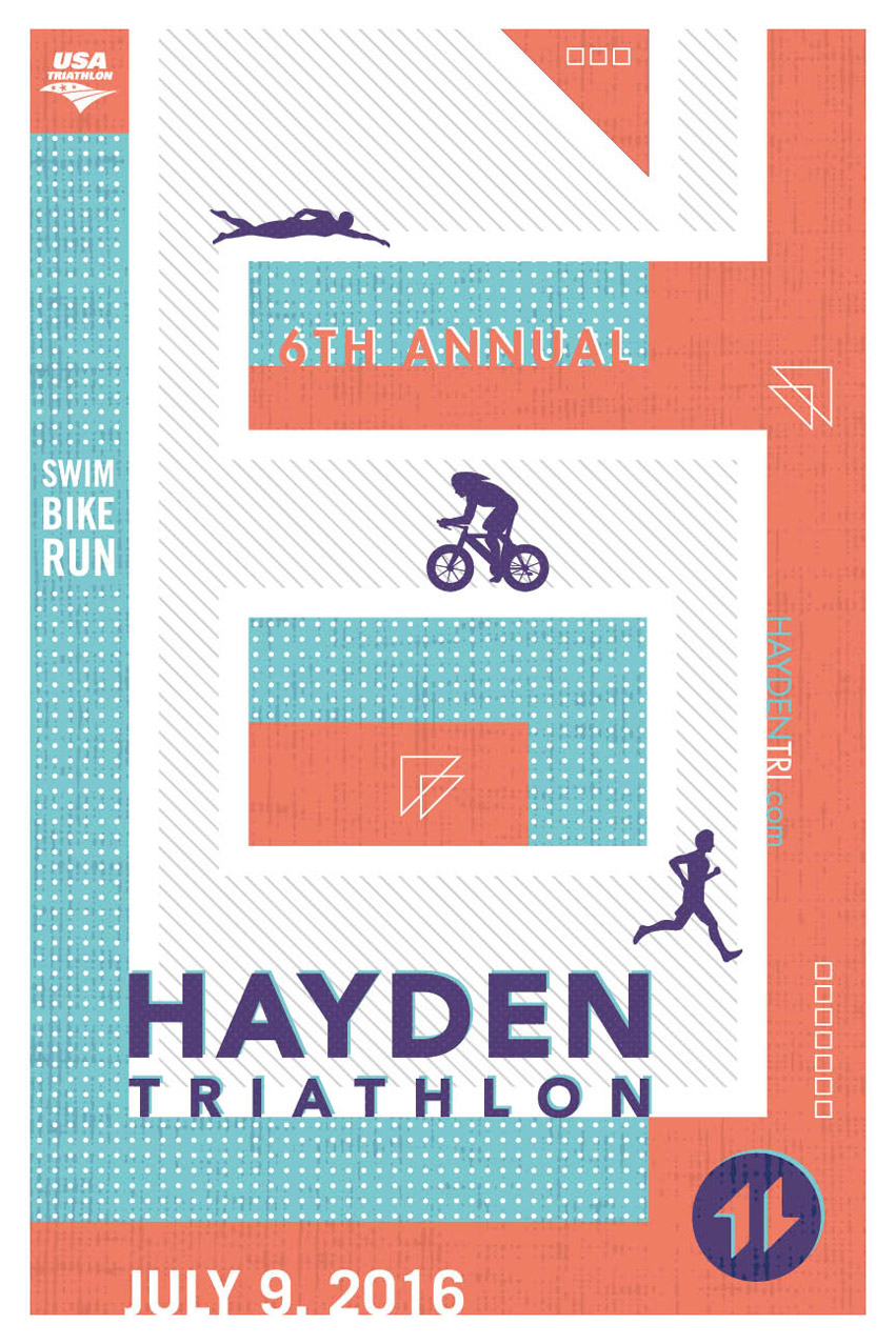
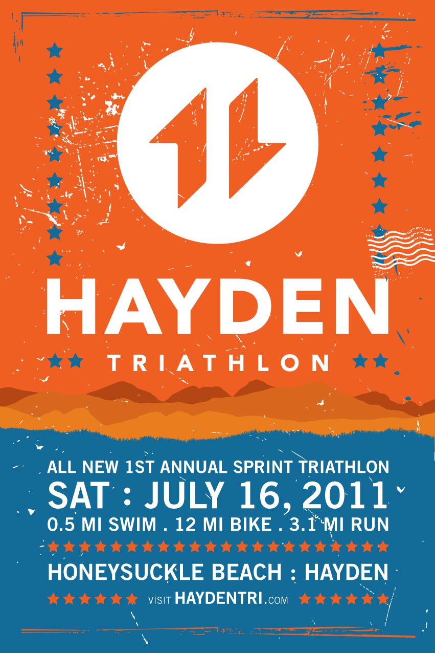
Hayden View Triathlon started in the summer of 2008. After 3 years of establishment, its brand has taken a toll. Series of events in 2010 have led to a substantial drop in brand equity. Many people enjoyed the beautiful race venue, but wondered about the uncertainty of the brand. Will it still go on…?
Tran Creative has revitalized the brand.
The Strategy:
A new group of motivated & community minded individuals have joined together to reorganize the event. We decided to give the event a new name, a shorter but more direct version from the original name. Since race organizers will be working closely with the City of Hayden, we view it best to call it the All-New Hayden Triathlon.
We wanted to start building brand equity for Hayden. Therefore, the word “View” was dropped because it now signifies a whole new beginning. Obviously, the venue is known for its majestic lake and scenic backdrop of Hayden Lake. “View” is no longer necessary.
The Ideas + Execution:
Research shows that most triathlon logos often have the 3 swim/bike/run figures. We wanted to be professional but unique and different than the rest.
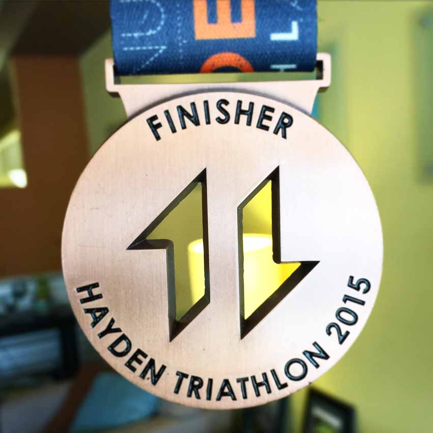
2 active shapes form letter “H” for Hayden. The 2 shapes also read “11”. It signifies the year the event entering into a new era. Orange = Sun + Energy + Passion. Blue = Water + Lake. The typography is clean and timeless so it could exist another 10-20 years.
Many of the local logos often feature pine trees, mountains, and elements that people are expected to see with first thoughts. In this design, we pushed the concept much further and took parts of these elements and applied them in a subtle style. Ex.: the left shape has character of the peak of a mountain. We added the diagonal lines to also communicate the mountain range that we have here in the area. The right shape is part of a person’s leg striking in running form.
Overall, Tran Creative made the logo easy to apply onto different applications + promotional items.
Visit the web site to learn more: www.HaydenTri.com

Tran Creative creates the new visual identity and website with a portal of training videos for Moneta Institute: provides training resources in accounting for Tribes across the US. The New Logo captures: letter M, digital/online network, connection and the accounting tree. The branches represent connection with users. The trunk contains the flow of information, providing good health and strength so everything can flourish.
Visit the new site at: monetainstitute.com.
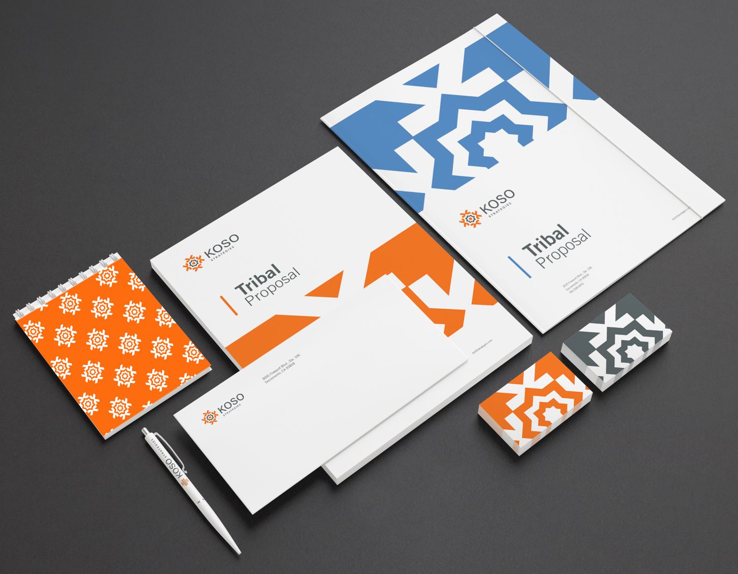
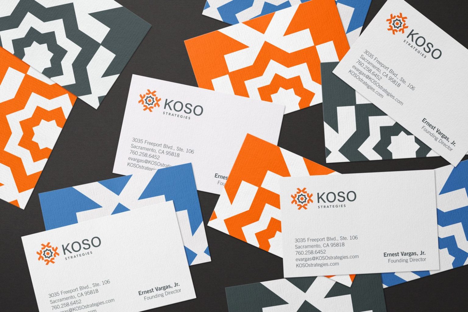
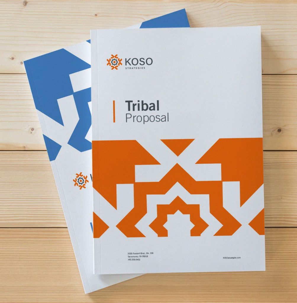
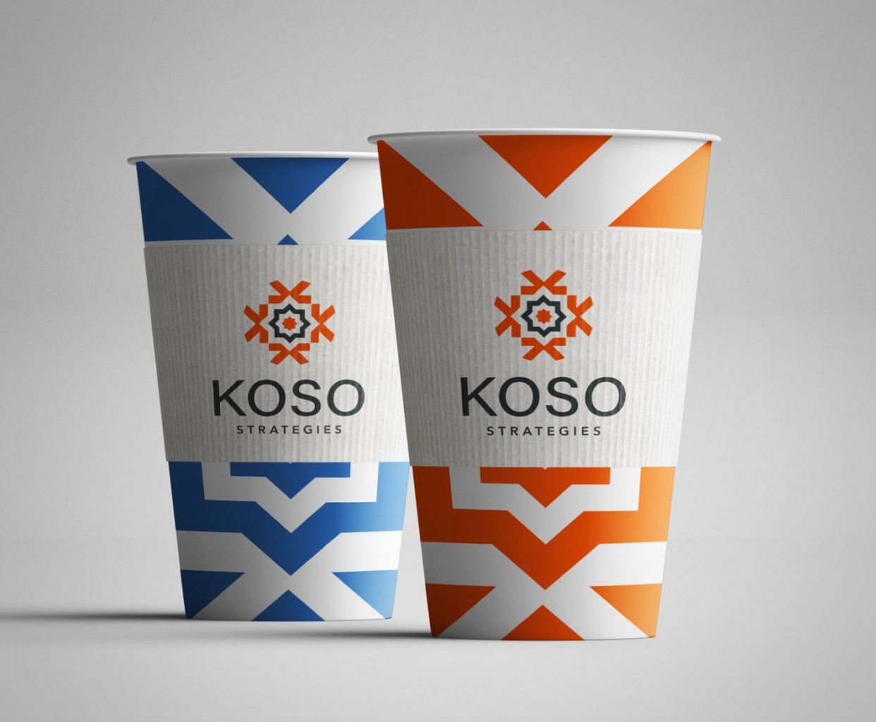
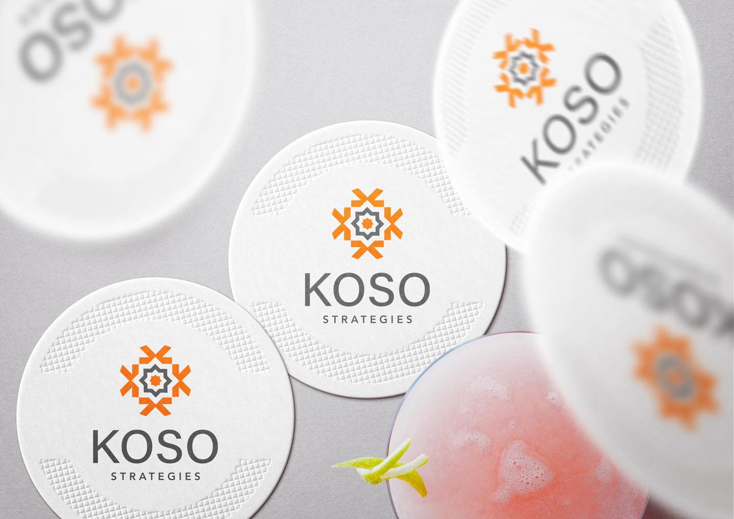
KOSO has extensive experience in every aspect of tribal government administration with over 40 years of government experience for specialities in training and consulting. The New Logo captures: K, ignition of inspiration where ideas are sparked, fostered, nurtured, grown to solutions by problem solving. Our creative team incorporated the K into KOSO brand tribal pattern to add flavors onto brand assets.

Tran Creative creates the new visual identity for Tribal Resource Alliance, providing resources for tribes in the US: tribal councils and government advising, tribal business management, finance, accounting, tribal audits, public relations, communications, software, IT support, and program development. The new logo captures: letter T, R, A, tribal pattern all connected together. New website launching soon.