Lean Bean Coffee

LeanBean_New_Old_logo_design_tran_creative_coeur_d_alene_idaho

Lean Bean Coffee has 2 locations in Coeur d’Alene. There is more than just coffee. For the past decade, Lean Bean has been serving coffee, breakfast, tea, fruit smoothies, and delicious lunch. The company is growing steadily and is looking to expand. Lean Bean hired Tran Creative to create a new visual identity.

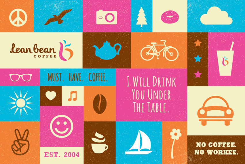
Through visual audits and research, we’ve found many existing coffee logos in circular shapes, cups, mugs, and coffee beans. After research, we’ve created over 100 logo variations. The chosen new logo captures the “L” & “b”. It is full of life, movement, and expression. The rising aroma adds flavor and tastiness to the brand.

Orange is for energy & passion. Hot pink is for fun & quirkiness. Blue is for balance & freshness. Brown preserves Lean Bean’s root – coffee.

Visit Lean Bean’s FB page to see what all the excitement is all about: www.facebook.com/Leanbeancoffee


Lean-Bean-Poster_visual_communication_design_tran_creative LeanBean_Billboard_graphic_design_tran_creative

Crandall Law Group

Crandall_Law_Group_logo_corporate_identity_tran_creative_coeur_d_alene_idaho

Tran Creative was hired to develop a corporate identity for Crandall Law Group, based in Hayden, Idaho. Crandall Law Group specializes in estate planning, asset protection, business & succession planning and more…

Research shows that many attorney logos often have the scales, the mallets and/or building columns. After over 100 logo concepts, the final chosen logo unifies two Cs, weaving together to form a multi-dimension “C” for Crandall. The connection of the two Cs represents the father and son team of attorneys, Jeff Crandall and Ryan Crandall. It also conveys working with clients side by side, in balance, with respect and fairness. It is a symbol of commitment, professionalism, success, and team work.

Color Orange represents passion, innovation and progressiveness. Slate Gray establishes trust, experience and stability.

The new logo is applied on all new marketing collaterals.


Crandall_Law_Group_Stationery_design_tran_creativecrandall_law_group_rackcard_tran_creative

TAIGA Land Company

TAIGA_land_company_logo_design_Tran_Creative

TAIGA Land Co. is a group of highly experienced professionals with proficiency in all major areas of real estate investments and development. TAIGA hired Tran Creative to provide branding services including the development of a new logo.

After much research and over 100 logo variations, the final chosen logo consists of 2 shapes organized to form a “T” for TAIGA in the negative space. The logo is also inspired by planning – plat map; looking down at a plan from high above provides a broader perspective. The logo is contain within a square to convey exactness and precision. Round corners communicate friendliness and approachability.

Color Green stands for land. Blue is for experience, trust and stability. Together, the blue and green also capture the Pacific Northwest.

The new logo is applied onto all future marketing collateral and a responsive web site set to launch first quarter of 2015.

Get In Touch

Interested in working with us?
We would love to help TELL YOUR STORY.

Logo

Create an identity to break the generic mold.

Web

Provide sleek and modern resources for your clients.

Marketing

Tell your story and increase your revenue.